Saturday, January 31, 2015

NCC presents: 30's wallpaper yellow rose nail art

I guess I'm cutting it short showing you the last of the four theme challenges post the 31st of January, but that still counts. ;) As you might know by now I've joined the nail challenge collaborative where we show four nail art's according to a specific theme each month.

This month the theme is wallpaper and as I said in my first post I decided to do a little "history lesson", doing my nail art's inspired by the wallpaper/interior designs of certain decades, going back in time. My last post was inspired by the 50s and today I'm showing a 30s wallpaper nail art.

Source 1 (refrigerator), Source 2 (yellow roses), Source 3 (pink roses)

I decided to skip the traditional art deco style which also was popular during the 30 and fell for these rose patterns. I decided for a gray base where I did a saran wrap with two gray polishes. Then I freehanded yellow roses. As the middle picture I decided for orange shadows in the roses and I also drew some leaves. Basically I'm pretty happy with the result, it looks like a painting in some ways because it's not so detailed. Also, much as a wallpaper I think it look the best from a distance, when I'm looking really close I think it looks weird. :P


Polishes used:
La Femme (gray)
KIKO - 329 (light gray)
KIKO - 368 (orange)
Essence - Love Is In The Air
Jordana Pop Art - Contemporary White


Friday, January 30, 2015

Color Club - Port-Folio, swatch

Today I'm showing Color Club - Port-Folio from the In True Fashion Collection from 2012. This polish has a warm purple base and is duochrome towards green (a green towards yellow). The effect is beautiful and I love it. It also covers in two coats. So if you haven't this and are in need of a great duochrome polish, what are you waiting for? ^^ And yea, sorry in advance for the picture spam ;)

Natural light.

Flourecent light.

Flourecent light.

Natural light.

Flourecent light.

Flourecent light.

Flourecent light.

Natural light.

Flourecent light.

Flourecent light.
Bought at Head2toebeauty for $3.10 back in 2012..

Thursday, January 29, 2015

NCC presents: 50s wallpaper nail art

Time for my third nail challenge collaborative post this month with the theme wallpaper. And as I said in my first post I decided to do a little "history lesson", doing my nail art's inspired by the wallpaper/interior designs of certain decades, going back in time. My last post was a 70's wallpaper nail art and next leap is into the 50s.

Source 1 (wallpaper pattern), Source 2 (yellow kitchen)
Well, obviously the 50s wasn't all yellow, I just happened to fall for that and I liked the pattern. The yellow kitchen is from 1959 and the wallpaper there is actually chickens. I also saw a blue kitchen in the same tone.

Basically I used the pattern from the wallpaper, yellow base, stripes and dots in white and gray, which looked kinda graphical and cool. The photos came out kinda weird (think it was dark when I took these) but overall I like this.


Polishes used:
Essence - Love Is In The Air
La Femme (gray)
Kleancolor - White
Jordana Pop Art - Contemporary White


An InLinkz Link-up

So what do you think? Anyone with knowledge from the 50s, did you see any yellow styling back then and also do you recall any other colors, color tones at that time? :)

Wednesday, January 28, 2015

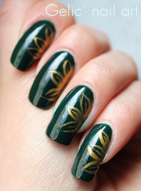
Gold and green flower nail art

For this week's Green Wednesday I'm showing a simple flower nail art on a green Catrice polish I've showed before. I think the dark forestry green shade and the gold suits perfectly together. I also love when polishes are and looks this shiny on photos. <3


Polishes used:
 L.A. Colors Art Deco - Gold Rush
Catrice - Hugo Moss

Tuesday, January 27, 2015

Essence - Love Is In The Air, swatch

Love Is In The Air is a light yellow creme shade from Essence. It is not a pastel in my eyes, it's too colorful for that but still slightly less bright to be an ordinary yellow. At the first coat it looked super opaque to be a yellow but for this I needed 4 coats to make it fully opaque (even though I did a nail art earlier on one nail where I only needed 3, but guess that was luck) Anyhow, I like the polish, this light yellow without being a pastel actually fill a gap in my stash..didn't have that particular nuance before.


Bought this at DM for 1,55 euro. DM is a german drog store.

Monday, January 26, 2015

Smitten Polish - Look To The Western Sky, swatch

Decided to layer this over the purple creme Claudia - 610. Look To The Western Sky is a gorgeous purple jelly with pink, yellow and orange hexagons and purple/pink(magenta?) colored tiny glitter. I used 3 coats to still achieve the jelly look because the glitter looks so much better when it's covered by the jelly in some places, like a jelly sandwich. However it is opaque on it's own too, I just thought it was handy when I already had purple on. Maybe the polish looks slightly darker than it originally is because 610 is influencing the finishing result. A really gorgeous polish which I can't understand why I've waited so long to use.


Bought years ago when Smitten Polish still had an etsy store.