Showing posts with label comparison. Show all posts

Saturday, April 18, 2015

Comparison; Nails Inc - Belgravia and China Claze - There's Snow One Like You

Yea I know, maybe not the right season. But while I'm at it, a comparison between Nails Inc - Belgravia and China Claze - There's Snow One Like You. Both are white texture polishes as you can see.

Nails Inc - Belgravia 

  • Jelly with sparse on texture, white hexagons and prismatic hexagons(which never look prismatic on the nail).
  • 4 coats (needed 5 on some nails).
  • Very difficult application, almost fishing for the texture and there is some dabbing needed to not get bald spots. In general less textured and not as "tipex white" as TSOLY.
  • Drying time is about 35-45 minutes. Quite similar to TSOLY, but I guess the many coats increase the drying time.
  • Cost; about $11 (CAD) (At the time I bought it, it was comparable to about 8 euro)

China Claze - There's Snow One Like You

  • Jelly/crelly filled with texture and white matte hexagon glitter.
  • 2 coats
  • Also difficult application, the formula is thick and "lumpy" with the texture/glitter, however much easier than Belgravia. Much more textured and more white than Belgravia.
  • Drying time is about 30 minutes which is normal for textures (imo).
  • Cost; about $4 (US) (At the time I bought it, it was comparable to about 4 euro)


Nails Inc - Belgravia


Nails Inc - Belgravia

China Claze - There's Snow One Like You

China Claze - There's Snow One Like You
So, overall I prefer China Claze - There's Snow One Like You. I know it has more of a cottage cheese feel or like really fluffy new fallen snow, but I like that. Also, TSOLY is half the price of Belgravia, and also TSOLY need half the amount of coats, which should mean that it would last twice as long (if any one would empty a bottle..). I didn't experience any major tip wear with any of them (however I wrapped the tips) but the only thing I didn't like with both of them is that the "texture balls" are gray toned plastic (as for all textures, but here it shows more). After a couple of days wearing for both TSOLY and Belgravia the gray plastic shows a tiny bit after some wear and tear (since there's no top coat), and makes the white look a bit "dirty" in an unpleasant way. Belgravia beeing less white from the beginning has an disadvantage there.

So, do you have any of these?  Which one do you prefer? Do you even like matte textures? ;)

Thursday, February 26, 2015

Comparison between Colorclub's Miss Bliss and Halo-Graphic

Third holo post in a row, and this time a comparison between Miss Bliss and Halo-Graphic. Actually thought that I had showed them on their own on the blog but seems like I haven't. XD

Anyhow. As you know Color Club 2012 came out with their first Halo Hues collection with the six polishes Halo-Graphic, Cloud Nine, Harp On It, Blue Heaven, Cherubic and Angel Kiss.
2013 Color Club came out with 6 more shades for Halo Hues which included Miss Bliss, Beyond, Eternal Beauty, Over The Moon, Cosmic Fate and Kismet.

To make a simple comparison between the collections, 2013 Halo Hues seemed more colorful and perhaps 2012 Halo Hues where slightly more holographic.

My Miss Bliss and Halo-Graphic are super similar. Miss Bliss seems slightly more pink, maybe more warm toned and Halo-Graphic is less pink and more cold toned. I also remember that I imagined my self that Halo-Graphic was slightly more holographic, maybe.. But just looking at them you wouldn't know, they look very close.


Also added Over The Moon to the underside of my nails. Which just was a good idea in theory. Mostly it just look grayish blue and therefore looked like dirty metallic. This shot it looked cool though.
Thoughts? I have seen swatches where I imagine that there are bigger difference between them, are yours as similar or is it just mine?

Tuesday, February 3, 2015

Comparison: Color Club - Port-Folio vs. Miyo - Mars

I knew that they weren't dupe's, but I thought they where similar, purple base and greenish color shift. I almost didn't buy Mars, because I thought it might be too similar. But when I compared them I saw that they where miles away from each other. What can we learn from this? Well, always buy polishes ;)


My index finger and ring finger are Miyo - Mars and my middle finger and little finger are Port-Folio. The pictures says it all but Color Club - Port-folio has a warm warm purple base towards a yellow toned green when shifting. And Miyo - Mars has a cold purple base towards teal. The color shifts in Port-Folio are also more visible.

For more photos and their original post:
Color Club - Port-Folio, swatch
Miyo - Mars, swatch


Flourecent light.

Natural light.


What do you think? Comparing them like this Port-Folio is much more striking than Mars, but I still like them both.

Saturday, November 2, 2013

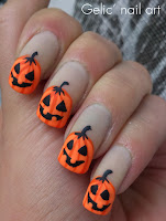
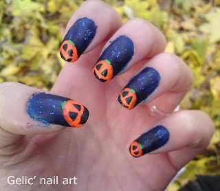
Pumpkin funky french - comparison

And, just for fun.. A post with both the matte and shiny version. Somehow I find the shiny version more vibrant in the colors so maybe I prefer that one more, then again matte is really cool. Which one do you prefer?

http://gelicnailart.blogspot.se/2013/11/halloween-pumpkin-funky-french-shiny.htmlhttp://gelicnailart.blogspot.se/2013/11/halloween-pumpkin-funky-french-matte.html

I'd also like to show you last year's pumpkin funky french I did. I'd definitely say that there has been a major improvement in just one year, both skills and technique but also taking photos, cleanup, placements etc.
http://gelicnailart.blogspot.se/2012/10/pumpkins-nail-art.html
To get to each post, just click the images. :)

Wednesday, October 16, 2013

Comparison neon pink polishes

During this week I've showed some pink neon polishes and I figured that it would be fun to compare them, not that they look like dupe's at all, but because I thought it would be fun to see them side to side.

From left to right I have;
CG - Love's A Beach
CG - Under The Boardwalk
CG - Hang-Ten Toes
Kleancolor - Neon Pink

I've used two coats on everyone except Hang-Ten Toes, where I needed three coats.

My thoughts:  All the China Glaze polishes have a sheer formula giving some VNL, it depend on how sensitive you are but I'm not bothered by it. CG - Love's A Beach and Hang-Ten Toes have a shimmer in them which is extra visible in the sun, making them almost glowing. Kleancolor is as you can see a creme and covers really well but needs the second coat to cover. For nail art Neon Pink is the best choice since it's the opaquest. Here it's also possible to actually see how red Under The Boardwalk looks comparing to the other. My favorite is with out doubt Love's A Beach, and as I said I'd use Neon Pink for nail art details :)
Attention.. some sad news (at least for me) you know the second polish, Under the boardwalk, today I found a new pink that I didn't know that I had, to make a long story short, at a facebook group things unraveled ; Under the boardwalk is NOT suppose to be pink, it should be purple (check pamsan's swatch out >here<). The mysteriously new pink I found was Beach Cruise-R, which should NOT be pink either!! However I remember it to be purple and other people also remembered it to be purple but now it has changed color. To clarify; in the collection there where two purple polishes, now both of them has changed color! There's no mislabeling, they where purple before but now they aren't. I think this is sad since they where my only purple neons and now I have none.... :(


Saturday, August 24, 2013

Comparison between Jordana Pop Art and L.A. Colors Art Deco

Hi, today I'm comparing the black fine liners from Jordana Pop Art -Black Mark and L.A. Colors Art Deco - Black. Both of them is what I consider creme which is the best fine liner formula since it often covers like a one coater.

If you're interested in more comparison between fine liners I've earlier have made a huge comparison and swatch post including 25 bottles in this link;  Large fine liner/striper nail art polish swatch guide
I really recommend you to check it out if you're in the mood of getting your self some fine liners. :)


Jordana Pop Art -Black Mark
6 ML

Mixing ball - yes

L.A. Colors Art Deco - Black
7,5 ML
Mixing ball - no

As you can see from the picture comparing the brushes, L.A. Colors Art Deco might have a slightly thinner brush, at least it's equal thin all the way while Jordana Pop Art seems brush seems to be thicker on the non painting end of them. However I believe that the difference is not enough to make a larger difference. I'd also like to note that my Jordana Pop Art is much newer than the L.A. Colors Art Deco and the formula is a bit thinner. I always find fine liners to be too thin when they're newly bought, making the color less opaque. Often I let them open with the cap to make the formula slightly thicker, ie perfect. However I always keeps it in that "thickness" and thin it when it gets too thick, because making nail art is a precision thing, and both too thin or too thick easily ruins nail art. I prefer to thin mine with acetone since it's the cheapest and easiest.

My conclusion is that I find them equally good and I'd go for the one with the best price or is on the same site as other favorite polishes are at.


For a bonus I also wanted to show you  BK nail art color, picture above, which I've bought through ebay. I bought the white color and it's actually the best white fine liner I've used, mainly because it's a true one coater and I also like that the brush is fairly short. If painting this white on a black base, it stays white and doesn't go "off white" or look light gray or something like that. The short brush make small precision painting much easier. I like this white one better than both Jordana Pop Art's and L.A. Colors Art Deco's white creme fine liners. The downside of BK nail art color is that it's only 5ML and that the brush is slightly thicker than the other two, however it's very high precision. 

Hope you nail art lovers (like Natalia who asked me about this) appreciates this post! :) If you have any questions, go ahead and ask!

Thursday, June 20, 2013

Pink speckled polish comparison

Hi, it's Thursday and let's make it pink with a comparison between pink polishes with matte black opaque glitter. Normally I'm not in to pink polishes (unless they're neon) but with black glitter anything goes, I LOVE black glitter.

And yes, pink and Thursday, for more pink polishes, check out Princessemma and her Pink Thursday theme. :)

At first I thought these three polishes where quite similar based at looking at the bottles. However I soon realized that they're are very far from each other on the nail. It's more like if they would be good for an ombre which means that I must get two more pink polishes with black glitter to make this work! ;) 


 Above you see the polishes on the nails. I've showed them separately swatched here at my blog before and if you want to come to the full blog post, just click the link below for each polish.

Smitten Polish - Ladybird. The darkest pink of the bunch and a crelly and 4 coats.

Pretty & Polished - Elvis Pink Cadillac. A baby pink jelly and  4 coats.

Smitten Polish - Cookies & Cream. A apricot colored crelly and 4 coats.

Saturday, March 9, 2013

My nail art stuff - part 1, rhinestones part 1

Hi!
I hope you're all doing fine! I'm feeling a bit down, my school assignment is going crap and bad luck is happening too often at the moment. I'm all stressed out over my upcoming diploma thesis and it was a long time ago I felt motivation. That's why I've been having less time for reading blogs, cocommenting on blogs, maintaining my own blog and even doing nail art(!). Luckily I have bought a lot of beautiful indies which doesn't need further decoration. (They will of cause be shown here at my blog.) Even though the blog takes time I think it's important that I let my self have some "free time"=blog/nail related time. And I really value every person who read and comment on my blog, that makes me very happy between all stress. :)

Now for some funnier stuff (maybe?) and I wanted to show you my nail art stuff. I have a lot of nail art stuff and I've noticed that many people doesn't like too many photos in one post so I figured that I divide them between posts. This time I'll show rhinestones. (haha, humongous amount of photos anyway...sry)

Above and below is most of my rhinestone wheels and rhinestone jars. In the photo there's also metal beads and flat glitter but I'll show them in another post.

To be able to make nail art it's not that important to have many sizes of rhinestones but I think it's fun and very versatile. I also use them and they're very cheap so I don't mind having many. Below are the sizes I've got.

In most of the rhinestone sizes I've got at least 12 colors but mostly more. The reason for is that they're often sold in 12, 16, 24packs.
1MM rhinestones
I have my index finger as a reference and also a ruler for you to get the picture.
2MM rhinestones
Between 1MM to 2MM I attach with top coat coat because they're very small and the topcoat covers them enough.
3MM rhinestones
From 3MM and larger rhinestones I attach with nail glue, otherwise they would pop of too easy.
4MM rhinestones
Up to 4MM I have no problem having them on my nails, the are easy to glue and the curves on my nails doesn't matter.

5MM pearl rhinestones
Up to 5MM the rhinestones are getting large and they are harder to place. I usually have them in the middle of my finger from the tip to the cuticles (where the nail is less curved.)
7MM rhinestones
The 7MM are harder to use, they fit my thumbs and can be applied on other nails with some tricks. I also use them on my toes as accent when it's summer.

Pink leopard spots and large rhinestones

To make the rhinestone manicure last as long as possible it is good to ad additional top coat (shown as gray) after the glue has dried. The images below is exaggerated, but I do this with the 3MM rhinestones too to be sure that they wont get stuck to anything which they will if the edge is open.

And if it isn't obvious, this is a stylized image of nails looking right in front of them at the top.
To see the funky french in the reference images above, click the image:
Humble Bee funky french

Saturday, March 2, 2013

Dotted gradient in mint, teal blue and mint green

I showed you a swatch of Pistacchio yesterday and today I figured it would be nice to show the nail art I did with it. I had in mind to show the color compared to other colors, like a comparison in a nail art. I've also tried doing this concept before, that the dots disappears into the gradient but that time the result wasn't what I expected. I think the result was better this time.

The base is of cause Pistacchio and I've then made a gradient in teal blue and mint green alternating nails over the tip.
Afterwards I just made dots in the Pistacchio shade to make them blend in. And then SV on top to make everything blend in better.
I like how the different colors emphasize each other and how the color of Pistacchio is compared to teal blue and mint green. I think that Pistacchio is more to the green than to the blue, but just by little.

Polishes used:
HM - Mint Madness
Kleancolor -Pastel Teal
Isadora - Pistacchio
I also wanted to see how it would look like in matte (I figured that if I didn't like the matte look I could just put a shiny top coat on instead) but this is what happened. The polish cracked. I guess it could have something to do with that I first had the base color, the had made the gradient/nail art and then one coat of SV. When I figured it was dry I added Madly Matte from Kleancolor and matte polishes are fast drying too so I guess the combination of SV and Madly Matte made it look like this. Sad to do all this work and then being forced to remove the whole thing.
So, what did you think about the nail art? Have the matte issue happened to you some time too?

Tuesday, September 18, 2012

Uninhibited Glow Stick

hihi, laughs at my cunning title.. ;) Before the autumn fully take's it grip I want to show you some neon. I do love neon and as a bonus there will be a neon comparison here as well, but we'll start with the nail art.

First we have Orly - Glow stick and over that I made a glitter gradient with L.A. girl - Uninhibited. I think I maybe did the gradient too glittery making it too black but I really like the concept of neon color and matte black glitter!


I really like the color of Glow Stick, it's such a great yellow neon color. It stands out from my other yellow neons because it has a hint of green in it making it "cold" and even more "neon".

Obviously I made a mini comparison:

Since neons always tend to be sheer I have a white base on all nails. All polishes have two coats on them, even though Funky yellow could have done with just one and maybe YPDB could have needed one extra coat, thinking back. My fingers looks really brown but I think that the nails are correct and that's the most important. As you can see Glowstick is really less yellow that the others. Kleancolor - Funky yellow is the most yellow, then followed by China Glaze - Yellow Polka Dot Bikini.

And the nail art on the comparison nails: I actually think that the difference of the polishes comes out even more with the black glitter.


And the last picture is with a giant cloudberry. When I wore this nails me and my dad where picking them. :)